That’s hot asAgreed and this is where I landed. More applications over on behance if you'd like to see more: Western Bulldogs Rebranding
View attachment 1888688
Navigation
Install the app
How to install the app on iOS
Follow along with the video below to see how to install our site as a web app on your home screen.
Note: This feature may not be available in some browsers.
More options
You are using an out of date browser. It may not display this or other websites correctly.
You should upgrade or use an alternative browser.
You should upgrade or use an alternative browser.
Discussion Logo Discussion Thread
- Thread starter akkaps
- Start date
- Tagged users None
RedmanWasHere
Rarely in kitchens at parties.
- Aug 23, 2010
- 27,030
- 29,950
- AFL Club
- Essendon
- Other Teams
- Exers, Gryffindor, Rich+Ess AFLW, Tassie
Yeovil in Somerset?
bomberclifford
Importer/Exporter
That’s a really well crafted crest design. Nicely balanced. Great to see some historical type get used across the identity as well.
- Jun 23, 2021
- 1,761
- 1,382
- AFL Club
- Melbourne
- Other Teams
- LA dodgers LA Kings Melbourne Aces
calculon559
Team Captain
- Jul 28, 2022
- 327
- 353
- AFL Club
- Geelong
Yeah, they've been out in the wild here for at least a week now. I know it's been in the States for a year, maybe they finally sold all the excess stock with the old logo? idk


Tandy
Norm Smith Medallist
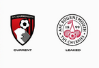
That 2000 logo was such an upgrade on the old version. To the point where the 2024 logo seems like a step backwards...in a bad way
RedmanWasHere
Rarely in kitchens at parties.
- Aug 23, 2010
- 27,030
- 29,950
- AFL Club
- Essendon
- Other Teams
- Exers, Gryffindor, Rich+Ess AFLW, Tassie
Rubber Arm
AFL Sucks
- Oct 10, 2018
- 1,656
- 3,587
- AFL Club
- North Melbourne
- Other Teams
- ^ I don't actually go for North.
I don't mind it, the old one looked like a rugby logo instead of footy
Fizzler
BBTB
- Dec 26, 2013
- 12,816
- 16,463
- AFL Club
- Port Adelaide
- Other Teams
- OKC, Coburg, Werribee, Storm, QPR
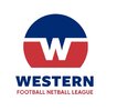
Was wondering when they’d rebrand to a FNL like Northern, Eastern, Riddell and others had done. Not the biggest fan on the actual logo itself but the old one was a touch dated. Perhaps it’ll grow on me.
Feraligatr
Official leader of the Official Sam Frost fan Club
- Jul 19, 2010
- 7,051
- 10,669
- AFL Club
- Richmond
- Other Teams
- Anahiem Ducks, Raptors
You know what I really like.Agreed and this is where I landed. More applications over on behance if you'd like to see more: Western Bulldogs Rebranding
View attachment 1888688
The dog looks like it has a halo because of the white line between the head and the flag.
10/10
- Moderator
- #4,391
Was wondering when they’d rebrand to a FNL like Northern, Eastern, Riddell and others had done. Not the biggest fan on the actual logo itself but the old one was a touch dated. Perhaps it’ll grow on me.
The new logo is worse than the old one. It's extremely top-heavy, and the cut-off circle at the bottom looks a bit ridiculous. I think there's a cool idea buried somewhere in there with the W and the extending lines but they certainly didn't find it.
RedmanWasHere
Rarely in kitchens at parties.
- Aug 23, 2010
- 27,030
- 29,950
- AFL Club
- Essendon
- Other Teams
- Exers, Gryffindor, Rich+Ess AFLW, Tassie
jumperfan
Debutant
- Nov 17, 2023
- 75
- 103
- AFL Club
- St Kilda
Looks like an anonymous car brand logo but it is better than "blue box with text"
Tandy
Norm Smith Medallist
Keep us posted. it looks clean so farThe new Auckland A-League team will reveal their logo in a few hours, but this is their teaser.
View attachment 1927214
Their team name is rumoured to be the 'Knights', so I wouldn't be surprised if that's a sword in the middle of the crest. Colours from the video seem to be black white and blue.
Tandy
Norm Smith Medallist
Like the inclusion of Netball. Every comp should be fnl to bring them all together. Not sure about ditching the word region. I would have liked them to go to something more traditional and timeless. Looks like a mix between a footy club logo and a trucking/freight company
- Jun 23, 2021
- 1,761
- 1,382
- AFL Club
- Melbourne
- Other Teams
- LA dodgers LA Kings Melbourne Aces
heard it was based off a former team/ is similar to
Well when the owner has a company called Black Knight, and the former team in the A-League was the New Zealand Knights, it's going to be at least a coincidence.heard it was based off a former team/ is similar to
Considering how poor that team was, I'd personally distance myself as far away as possible from that rabble

akkaps
Community Leader
- Mar 20, 2012
- 47,515
- 32,707
- AFL Club
- Carlton
- Thread starter
- Moderator
- #4,400
Auckland’s A-League franchise officially named Auckland FC
But the 'Black Knights' moniker remains present.
