Lion_LegacyXL
Club Legend
- Aug 22, 2019
- 1,673
- 2,131
- AFL Club
- Brisbane Lions
Follow along with the video below to see how to install our site as a web app on your home screen.
Note: This feature may not be available in some browsers.
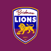
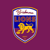
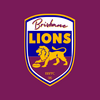
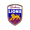
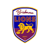
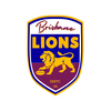
It's a toughy modernising that shield, I did this one a while back and wasn't entirely happy with itSome alternate variations, not entirely convinced on the "Brisbane" font.
View attachment 1958093View attachment 1958094View attachment 1958093View attachment 1958095View attachment 1958097View attachment 1958098
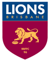
I like the BBFFC 96 at the bottomIt's a toughy modernising that shield, I did this one a while back and wasn't entirely happy with it
View attachment 1958147
Yeah was trying to figure out how to integrate that, was a part I really wanted on the logoI like the BBFFC 96 at the bottom
It's a toughy modernising that shield, I did this one a while back and wasn't entirely happy with it
View attachment 1958147
The old school lion needs a redraw too but that's a much tricker job to do just for fun.
I think this is my favourite of the bunch so far, aside from the bottom not having the BBFFC 96 on it. My only suggestion is that perhaps the top of the top of the shield shouldn’t flatten out in the middle, it should continue with the same curve as the text so that the middle of the word Brisbane isn’t so cramped.
I had a quick go at a clean up. If I had more time it would be executed better, but it shows what sort of change i'm proposing.
In GIF form for comparison's sake:

And without the animation:

I made some versions with the improved LionI think this is my favourite of the bunch so far, aside from the bottom not having the BBFFC 96 on it. My only suggestion is that perhaps the top of the top of the shield shouldn’t flatten out in the middle, it should continue with the same curve as the text so that the middle of the word Brisbane isn’t so cramped.
If you wanted to, I’d also suggest a new logo containing the Fitzroy Lion could probably also see the Lion itself cleaned up a little bit. I’ve been a big fan of Scorch’s cleanup he did back in 2015 to the point of always using it for hypothetical designs in place of what the Lions actually use, it’s a ripper.
Word is they’ll just be “The Athletics” while they’re in Sacramento. Would’ve been cool to see them rebrand as something like the California Athletics while they’re still based in the same state but alas, only a temporary situation so it won’t matter in the grand scheme of things.Also in American sports home base changes, the Oakland A's will be playing out of Sacramento until their stadium in Las Vegas is built
This is what I don't get about American sports. Why the hell wouldn't the new owner just build a brand new club in Utah instead of taking the Coyotes away from AZ?Meanwhile the Arizona Coyotes have the option to return to the league as an expansion team if they build a new arena within five years and retain their identity and history.
As is often the case, it’s arena related. This reddit comment should be able to explain it better than I can though.This is what I don't get about American sports. Why the hell wouldn't the new owner just build a brand new club in Utah instead of taking the Coyotes away from AZ?
Fury, Venom or hockey club would be the likely candidates, Blizzard is too close to the Avalanche so that wouldn't work. Really dissapointing to see the yotes leave the leagueSo, The NHL's Arizona Coyotes have officially relocated to Utah as of today and will have a new identity, five names have been trademarked.
Utah Blizzard
Utah Venom
Utah Fury
Utah Hockey Club
Utah HC
I presume the generic HC would be temporary until they come up with a proper name, sort of like a Washington Football Team situation. They said they wouldn't rush their identity but they already have three names floated, so take of that what you will.
Meanwhile the Arizona Coyotes have the option to return to the league as an expansion team if they build a new arena within five years and retain their identity and history.
Maybe not a question for here, just curious-Also, something from the Brazilian media.
Does this Brazilian TV channel logo look familiar?
View attachment 1964532
I wouldn't think so - it looks sufficiently different to me, and I'd imagine there's not a great deal of cross-over in terms of target markets. It's understandable other broadcasters might want to have a logo based on a Lissajous curve related to sound production (in ABC's case for radio & tv). Care to comment GremioPower ?Maybe not a question for here, just curious-
Would the ABC be in any position to claim copyright, win damages etc? Being a foreign government funded organisation and all?
I wouldn't think so - it looks sufficiently different to me, and I'd imagine there's not a great deal of cross-over in terms of target markets. It's understandable other broadcasters might want to have a logo based on a Lissajous curve related to sound production (in ABC's case for radio & tv). Care to comment GremioPower ?
