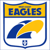
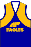
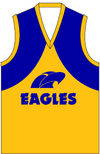
What do you and other WCE fans think of the Eagle? Go back to the original one, or keep the current one?Our best jumper is the one we've worn in our 4 premiership wins, IMO.
I've never been a fan of the white outline on the logo and wings either, I think it detracts from the overall look.
I don't mind navy for off-field merch and the occasional throwback like this one, but royal blue is our most iconic, and best look in my humble opinion.
Navigation
Install the app
How to install the app on iOS
Follow along with the video below to see how to install our site as a web app on your home screen.
Note: This feature may not be available in some browsers.
More options
-
 BigFooty Tipping Notice Img
Weekly Prize - Join Any Time - Tip Round 10
The Golden Ticket - MCG and Marvel Medallion Club tickets and Corporate Box tickets at the Gabba, MCG and Marvel.
Round 9 Winner: philreich
You are using an out of date browser. It may not display this or other websites correctly.
You should upgrade or use an alternative browser.
You should upgrade or use an alternative browser.
Discussion Round 4 "Gather Round": Photos and Discussion
- Thread starter TY24
- Start date
- Tagged users None
- Apr 30, 2015
- 13,643
- 24,471
- AFL Club
- West Coast
We should never have abandoned the original one. However, the current logo does the job pretty well, and is light years ahead of our last logo, so not fussed.What do you and other WCE fans think of the Eagle? Go back to the original one, or keep the current one?
- Thread starter
- #54
The OG is more versatile in that it can be all gold, blue with a gold beak, or all blue depending on the applicationWhat do you and other WCE fans think of the Eagle? Go back to the original one, or keep the current one?


It's a solid logo and looks good on the jumper, in both colourways.
I think the current logo is a better logo, but doesn't present on the jumper as well, particularly on the gold wings.
I don't see us changing any time soon, which is good. As Freight Train touched on in a separate thread, we have one of the strongest identities in the competition and any change to that would be making a change for changes sake.
Similar threads
- Replies
- 160
- Views
- 6K
- Replies
- 37
- Views
- 2K


