Navigation
Install the app
How to install the app on iOS
Follow along with the video below to see how to install our site as a web app on your home screen.
Note: This feature may not be available in some browsers.
More options
You are using an out of date browser. It may not display this or other websites correctly.
You should upgrade or use an alternative browser.
You should upgrade or use an alternative browser.
Discussion Logo Discussion Thread
- Thread starter akkaps
- Start date
- Tagged users None
New

Old


Old

RedmanWasHere
Rarely in kitchens at parties.
- Aug 23, 2010
- 27,110
- 30,214
- AFL Club
- Essendon
- Other Teams
- Exers, Gryffindor, Rich+Ess AFLW, Tassie
Another drinks joint has come straight out of Maccas.

- Jun 29, 2021
- 3,916
- 8,931
- AFL Club
- Richmond
Maybe I'm a miserable bastard but it's a bit shit.New Firebirds logo
View attachment 1872081
- Moderator
- #4,357
This one was on the cards for a while. The Firebirds Futures (reserves team) had this as their logo, and have been wearing the same colour scheme as the logo (lilac with purple trim). I guess it was pretty well received at that level.


Nothing screams "Firebirds" like... lilac.New Firebirds logo
View attachment 1872081
- Mar 30, 2014
- 2,631
- 4,326
- AFL Club
- Brisbane Lions
- Other Teams
- Dolphins, Seattle Kraken
It's one of them lilac firesNothing screams "Firebirds" like... lilac.
Oh, a candle. I get it now. Very fearsomeIt's one of them lilac fires
RedmanWasHere
Rarely in kitchens at parties.
- Aug 23, 2010
- 27,110
- 30,214
- AFL Club
- Essendon
- Other Teams
- Exers, Gryffindor, Rich+Ess AFLW, Tassie
Before.

After.

After.

- May 23, 2016
- 721
- 844
- AFL Club
- St Kilda
- Other Teams
- Port Melbourne; Kalkee; Horsham Demons
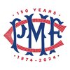
Port Melbourne has updated it's logo to celebrate 150 years. I hope it stays, I really prefer it to the updated version of the VFA logo we've been running with for the past couple of years. Apparently this monogram was used in the late 19th/early 20th century and even appeared on the guernsey for a year or two.
NEW OLD OLDER OLDEST


NEW OLD OLDER OLDEST


- Oct 30, 2014
- 4,313
- 8,391
- AFL Club
- Western Bulldogs
I have always loved the flag logo as our best ever and your logo modernises that great logo and maybe even improves upon it? The 2nd one is definitely better with our hoops, could a triangle version work? The Bulldog looks great standing up nice and strong. This logo is way way better than our current one, well done.I've actually also been working on a new dogs' logo, this one based on the traditional logo. Still editing and refining but getting there. Not sure which flag to go with.
View attachment 1825343View attachment 1825344
The Inspo:
View attachment 1825348
RedmanWasHere
Rarely in kitchens at parties.
- Aug 23, 2010
- 27,110
- 30,214
- AFL Club
- Essendon
- Other Teams
- Exers, Gryffindor, Rich+Ess AFLW, Tassie
- Jul 25, 2021
- 179
- 199
- AFL Club
- Richmond
- Other Teams
- Persib Bandung (EST.1933),
Pakenhamsaint
Premium Platinum
- Jan 5, 2011
- 46,428
- 37,942
- AFL Club
- St Kilda
Old
New
New vans as well
New
New vans as well
RedmanWasHere
Rarely in kitchens at parties.
- Aug 23, 2010
- 27,110
- 30,214
- AFL Club
- Essendon
- Other Teams
- Exers, Gryffindor, Rich+Ess AFLW, Tassie
Old
New
New vans as well
From identifiable and iconic to blah.
- Mar 30, 2014
- 2,631
- 4,326
- AFL Club
- Brisbane Lions
- Other Teams
- Dolphins, Seattle Kraken
To be honest, it's kinda clever. The logo itself is a wrench inside a map pin, it makes sense.From identifiable and iconic to blah.
Freight Train
Maccas footy aficionado
- Moderator
- #4,370
Old
New
New vans as well
As stated above, it’s clever branding, but it also looks like a logo/brand template design you’d download off Adobe Stock or Vecteezy.
Probably could have done more to retain some degree of the brand awareness and nostalgia of the previous brand whilst still modernising it.
It's either a misshapen heart, or possibly blood... the Red Cross is diversifying, either way!To be honest, it's kinda clever. The logo itself is a wrench inside a map pin, it makes sense.
Pakenhamsaint
Premium Platinum
- Jan 5, 2011
- 46,428
- 37,942
- AFL Club
- St Kilda
That's what they were going withTo be honest, it's kinda clever. The logo itself is a wrench inside a map pin, it makes sense.

Lube Mobile Launches Bold New Look and Renewed Commitment of 'Auto Service Delivered'
Australia's most loved mobile mechanical service provider, Lube Mobile, launches a fresh new look. Lube Mobile launches a renewed 'auto serviced deliv
autodeadline.com.au
The fresh look also features a modern take on Lube Mobile's trademark spanner logo, incorporating it into a location point – showcasing how the service provider will come to you and live up to the auto service delivered proposition.
- Mar 30, 2014
- 2,631
- 4,326
- AFL Club
- Brisbane Lions
- Other Teams
- Dolphins, Seattle Kraken
I dont think anyone would confuse it with the red cross. Unless they own the rights to the colour red, maybe Eddie works there now?It's either a misshapen heart, or possibly blood... the Red Cross is diversifying, either way!
RWB_Threads
Debutant
Agreed and this is where I landed. More applications over on behance if you'd like to see more: Western Bulldogs RebrandingI have always loved the flag logo as our best ever and your logo modernises that great logo and maybe even improves upon it? The 2nd one is definitely better with our hoops, could a triangle version work? The Bulldog looks great standing up nice and strong. This logo is way way better than our current one, well done.
View attachment hoops.png
- Oct 30, 2014
- 4,313
- 8,391
- AFL Club
- Western Bulldogs
That stuff on your site looks amazing, well done. You’ve got the royal blue right too, often too dark like the BLK days. I like the look of the Sir Doug Nicholls round with the aboriginal flag, but each year on here I wonder whether we could or should be the dingoes instead of bulldogs in those rounds?Agreed and this is where I landed. More applications over on behance if you'd like to see more: Western Bulldogs Rebranding
View attachment 1888688


