caloschwaby
Whisper
- Jan 3, 2017
- 4,888
- 6,550
- AFL Club
- Collingwood

- Other Teams
- Celtics, Renegades, Packers
At this point wish they'd just gone with the state logo as their official logo lol
Follow along with the video below to see how to install our site as a web app on your home screen.
Note: This feature may not be available in some browsers.
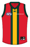
Not sure if I ever got around to posting these left over concepts but here they are anyway. Just goes to show it doesn't have to be anything crazy. They should embrace the Rastafari vibes
View attachment 1933080View attachment 1933081View attachment 1933082
Something like this? Had this initially but figured there were already a lot of red-based jumpers in the league but it does look alright as a clash/alternate kitI think this is the best set I’ve seen. A unique design at AFL level yet it’s still a ‘traditional’ footy design for a team that rightly wants to lean into its extensive history.
One thing I would say is I think this colour set lends itself to a dedicated away jumper, with a white clash in reserve if absolutely necessary. The primrose would work well as the base for an away jumper and avoids that soulless ‘everyone needs a white clash jumper’ problem that we seem to have moved away from in recent years.
That second jumper with a primrose base instead a white base would be a perfect away jumper IMO.


Ah sorry, my understanding was that primrose is the yellow colour. They’re still nice kits thoughSomething like this? Had this initially but figured there were already a lot of red-based jumpers in the league but it does look alright as a clash/alternate kit
View attachment 1934112View attachment 1934114
Oh nah that's my bad I must have gotten them mixed up somehow. I'll have a go at that one tomorrow if I find a sec.Ah sorry, my understanding was that primrose is the yellow colour. They’re still nice kits though
Just saw Jack Riewoldt say that he helped design the logo and they had multiple to pick from and that was the best one. Also said there's plans to have a "big wild logo" on the jumper
Do you recall the source for this?
Sent from my iPhone using BigFooty.com
Something similar to this is nearly 100% chance to be worn at some stage.Saw this on Facebook and there is something I just like about this jumper. The way the map creates a yoke and side panels just works for me.
I'd probably flip the colours around so the map part is green but it's an interesting take. The large map would probably also look good as an outline similar to the GWS never surrender or Adelaide gather round jumper.View attachment 1933685
very niceActually like the old logo, they could have incorporated the map as the "shield". The text and map shape would need more refining, but you get the picture
View attachment 1935885
Please send this to the club immediately before they make any more bad decisionsActually like the old logo, they could have incorporated the map as the "shield". The text and map shape would need more refining, but you get the picture
View attachment 1935885
perfectAll it needs are small tweaks to make it a good logo as far as AFL standards go. The other logo is just unfixable, I've tried. For what it's worth I really like the new wordmark, easily better than the previous one.
View attachment 1936018 View attachment 1936028
The one on the right is 100% it. Obviously font could be hand-made to fit the curvature but you did a good enough job for the idea.All it needs are small tweaks to make it a good logo as far as AFL standards go. The other logo is just unfixable, I've tried. For what it's worth I really like the new wordmark, easily better than the previous one.
View attachment 1936018 View attachment 1936028
I can't un-see this now!The old logo looks like a trophy head on a house lounge room wall
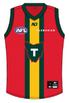
Quick mock up of Magpienato's designI'd be amazed if some version of this hasn't been done before but a bit of a combination of the racecar stripe design with a 'T' design.
Prison bar vibes but maybe a bit too close to Adelaide vibes.
View attachment 1934134

fook me that is nice!!! would like to see these played out in the 2x other colour variants for clash/away.I'd be amazed if some version of this hasn't been done before but a bit of a combination of the racecar stripe design with a 'T' design.
Prison bar vibes but maybe a bit too close to Adelaide vibes.
View attachment 1934134
