Hey guys ") I've been thinking about how a Tassie team's guernsey could look should we be granted a license to join the league as a stand-alone club (not a relocation).
I've been thinking about how a Tassie team's guernsey could look should we be granted a license to join the league as a stand-alone club (not a relocation).
I don't think we should enter the league with the traditional map jumper for a couple of reasons:
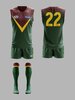
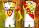
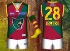
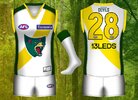
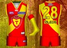
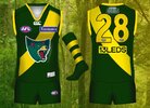
Here is the design I've come up with:

I've been thinking about how a Tassie team's guernsey could look should we be granted a license to join the league as a stand-alone club (not a relocation).I don't think we should enter the league with the traditional map jumper for a couple of reasons:
- It's a state of origin jumper. We'd be entering the league as a club representing a state, rather than as a state (same as the Adelaide Crows).
- Whilst very traditional, it's a pretty bland design.
Here is the design I've come up with: