Discussion Tasmania AFL Jumper Design

Remove this Banner Ad

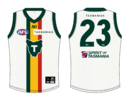
Here is a very quick attempt to tie the brand identity and the foundation jumper together a bit better:

View attachment 1932558
Massive improvement. There's something aout that stylised Map of Tassie logo/shield just seems to....tie in better with the Devils brand?

It also warrants mentioning that Carlton have a long history of running concurrent jumper monogram / corporate logo combos. This concept makes Tassie doing the same thing seem a lot more palatable and gives it a sense of organic identity that is lacking with GC + GWS.
 
I guess this officially puts an end to state of origin.

I have no issue the state jumper, think its fine and traditional.

I am sure graphic designers can have a lot of fun with the away/clash jumper.
 

Log in to remove this ad.

Here is a very quick attempt to tie the brand identity and the foundation jumper together a bit better:

View attachment 1932558
I think this is the sort of thing we'll see over the years. That's why they're calling the map design the 'foundation' ... it can be reinterpreted year to year like a premier league kit. I think it's a good idea.
 
Yep, very much like what I saw. Red collar and sleeves I think.

And the background pattern was probably a little more pronounced and noticeable.
I hate the red collar and sleeves. Red on green just doesn't work. Needs to have the gold between them.

I deliberately dropped the opacity of the background pattern because I thought it was too busy + changed the shape of the map to the one in the trademarked logo and made it a bit smaller.
 
That motto...hints of a club song?

"We are the team in the AFL,
One of the teams of all time,
We exist to play football,
and will play it against others"
It genuinely could be though... a lot of local footy clubs have songs that go to the way of:
"We are the ------
We are the team
We can't be beaten this must be seen
At the end of the season, you'll know the reason
We are the premier team"

Wouldn't be surprised considering the 'tradition' approach taken by the club.
 
I love the logo, but feel its a bit too busy to feature on our home jumper. Footy jumpers need to be simple enough that kids can draw them imo.
Agree - jumper based logos need to be simple and clear - like the Eagles and Bulldogs.

Something that's easy enough for a kid to draw. The Devil looks good, but is overly complicated
 

(Log in to remove this ad.)

I guess this officially puts an end to state of origin.

I have no issue the state jumper, think its fine and traditional.

I am sure graphic designers can have a lot of fun with the away/clash jumper.
No. Its a foundation jumper. Still 4 years to work on the playing strip. Who knows, as yet they may play their first game in it!
 
Really don't understand the thought that the old s**t Devils logo is better, it's simply not. It was terrible amateur league stuff. This logo looks good other than the weird chin bit. Massive improvement on the old crap logo.

IMO they've done a lot right, they've been strong enough to stick with the traditional colours and bring green into the AFL, and gone with the nickname that was the clear and sensible name rather than some marketing gimmick.

The part that's just strange is that they seem to believe that the Tassie rep jumper is the style that would be most popular with Tassie people in uniting them. I don't get it, but I'm not Tasmanian, to me it was always a terrible jumper, so that hasn't changed and I don't get it. But the easiest part of the release and reveal I don't get is how that logos chin got through reviews without someone saying what is going on with that chin. Hopefully the final jumper has a bit more character, but if the Tassie people love it??? Then maybe who am I to question it.
 
Last edited:
Really don't understand the thought that the old s**t Devils logo is better, it's simply not. It was terrible amateur league stuff. This logo looks good other than the weird chin bit. Massive improvement on the old crap logo.
Might be something to do with the fact that the "old" Devils logo (was made in 2018 so hardly old) actually looks like a Tasmanian Devil.

This new Tasmania logo is the textbook definition of amateur. Lacks structure, lacks character, lacks distinction and most importantly lacks integration with any aspect of the Tasmanian identity whatsoever.

To say it already looks aged isn't entirely true because that would imply it was ever really in vogue or contemporary with any design style or convention.

I've tried to make some logos/emblems in my time here and trust me, it takes an amateur designer to know an amateur design. You're absolutely entitled to your opinion but it's clear you're not really sure what you're talking about.
Will agree to disagree. That old logo is a shocker belongs at some Div 7 SANFL ammos club. Certainly not some high watermark in the history of logos.
 

Remove this Banner Ad

Back
Top