Opinion Team Jumper

What Team Jumper Should Tas Wear?

  • The State Jumper

    Votes: 31 17.5%
  • New Jumper With the State Team Colours

    Votes: 105 59.3%
  • State team design but logo instead of map

    Votes: 9 5.1%
  • Something completely original

    Votes: 32 18.1%

  • Total voters
    177

Remove this Banner Ad

Sorry, No.
People here (& me :)) expect a predominantly green jumper & shorts. Add some red & yellow. Thats it.
The Tassie state jumper of 1977 had some vertical panels but was soon forgotten.
We want to start with some tradition.
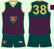
Well I was thinking bottle green, Maroon and yellow candy stripes. Just reckon it would be a good guernsey. Maybe not a home guernsey, which means there's probably no room for it anyway. What tradition do you want to go with? The Tassie state map with a bold letter T inside? You guys get to make your own tradition aswell. You'll end up with a Port style Chevron and that'll be a real shame imo
 

Log in to remove this ad.

View attachment 1898742
Was used for a lower tier soO i think. Found on Google. There's something in this. Without the T

Get rid of the map and make the T gold, and I reckon it's pretty close to what they might land on. I've thought all along that the T needs to be the brand, they can't rely on the map.
 

(Log in to remove this ad.)


"Tasmania Fotball Club" should be the basis of a monogram to keep the club distinct from the state team. TFC. I am sure the classic T logo on a detailed map will be avoided by the club, I certainly hope so.
Green is not often used for sports teams, especially darker greens, because of a camoflage effect for the players... but I still expect that to be prominent. Devils is the no brainer...
 
This is my preference for the jumper design. Was always going to be the state jumper though. Wish they'd gone for something new to represent the club and left the state jumper for representative footy, but I guess it could have been much much worse considering what some other clubs are running around in.

0843-Tasmania-AFL-Jumper-Design-(no-pattern)-V01.jpg
 
This is my preference for the jumper design. Was always going to be the state jumper though. Wish they'd gone for something new to represent the club and left the state jumper for representative footy, but I guess it could have been much much worse considering what some other clubs are running around in.

View attachment 1922159
Quite stylish. :)
 
This is my preference for the jumper design. Was always going to be the state jumper though. Wish they'd gone for something new to represent the club and left the state jumper for representative footy, but I guess it could have been much much worse considering what some other clubs are running around in.

View attachment 1922159
It has to be a V. Saw an Examiner selection of nine jumpers recently, all crap! This one comes close - I'd have the rose replaced with more green, and a double V straighter than yours but in the same position with both red or rose and a strong yellow, tapered and pointy at the cuffs but fuller in the middle. No T - they all look awful. Our brand should be dark green, not a T or a map...

Or, having said that, where the V sits in the middle, maybe a small T or map or logo...unobtrusive in the middle of overwhelming sea of green and a physique accentuating V...! I want my team looking like brick shithouses, not primary school geography or alphabet displays...!
 
329a4155ddefc2d5e58b9206ceeb225a.jpeg
I've flipped and flopped on what I think the best course of action would be.
The allure of something new and shiny is quite attractive...
But let's be real, the Map jumper is one of the best of all time, and nothing they come up with through an explorative branding project is going to come close. The map stands up equal right next to the league's timeless stripes, hoops, sashes, yokes... can the same be said for Gold Coast and GWS?

My main hope now is that they opt for a stylised variant of the map - more akin to the old knitted style.
In recent years the map has been akin to a vector map of Tasmania, straight out of a wikipedia article, like this:
images.jpeg
It should be an emblem that represents Tasmania, not a literal topographical map.
 
I just created a concept home and away jersey today, haven’t designed jerseys in a decade so I’m a bit rusty but interested in peoples thoughts. IMG_0064.png
 
Back
Top