Workshop Non-Footy Designs - A No-Guernsey Area

Remove this Banner Ad

Watched the late night news last night and they did a tomorrow's newspapers spot and they put up the Guardian's website which for me jarred with the other newspaper presentations so I thought it might be good to see what the Guardian Australia's current headlines might look like in a newspaper format. the I'm not happy with the spacing of the articles themselves in my mock up but I don't mind the idea.

I don't buy physical newspapers but I get replicas downloaded to my iPad everyday. I like the newspaper format, it gets me to read articles I would otherwise not click on and I hope it continues in the digital realm long after physical newspapers are out of print.

upload_2017-8-16_10-38-32.png
 
The Toronto Maple Leafs used to be a baseball team...hell, they predated the hockey Leafs. Recalling my MLB Rivalry series, I revisited that time I posted a Blue Jays set in their style, with tweaks to the scripts and striping. The scripts kinda mismatch due to the source material I used.


Even made pullovers for the occasion, using the current split lettering.


Even though it's not as common as it used to be, it's still not unheard of for a baseball team's home and away scripts to mismatch...that said, what CCSLC posters will tolerate for a one-off, they often won't for something meant to be used full time, the mismatching scripts joining those ranks. So I posted revised home/away sets, one with the giant slanted script and one with the straight script. I'd also gone with a lighter grey in the revamp, as I got a lot of complaints about the initial grey being too dark. Given that particular shade gave me a lot of grief in an earlier concept a few years earlier, I've since sworn off its use.
 

Log in to remove this ad.

Thought I'd give a Tigers design anther go. So this concept set is based on the Tigers 2018 Members Jersey.

Wests%20Tigers%20Members%20Jersey%202019%20Concepts_zpsyorbyfxw.png
 

I really prefer the 'Transport for Victoria' name over PTV. I know the two are distinct bodies, and maybe I am just associating the name with the Transport for London brand I saw plastered all over the tube, but I like the name and the modern look the State Government has gone with lately.

Anyway, here are some platform signs.
upload_2018-5-24_0-17-2.png


And since Transport for Victoria includes Vic Roads

upload_2018-5-24_0-47-55.png
 
Last edited:
I really prefer the 'Transport for Victoria' name over PTV. I know the two are distinct bodies, and maybe I am just associating the name with the Transport for London brand I saw plastered all over the tube, but I like the name and the modern look the State Government has gone with lately.

Anyway, here are some platform signs.
View attachment 501408
Really really really good. I like how Metro is keeping the Metlink vibe with what they’ve got, but if PTV became [opposite of privatised] these would be the best bet for what’s next. Really like how it’s riffing off the triangle theme. Also, I know it’s just an example, but for the record Parliament only has 4 platforms. Could you possibly do a tram stop mock-up, pretty much green instead of orange on the bus one.
Love your work.
 
Lower level footy clubs often mimic the guernseys of AFL clubs. Ice hockey, much the same story, with Canadiens, Maple Leafs, Red Wings and Blackhawks mimicry being particularly popular (to the point of there being teams called the Toronto Jr. Canadiens and Motor City Hawks...I've seen a picture of another Canadiens mimic team that was wearing black, of all colors. To say the least, didn't look right, only saving grace is it wasn't the real Habs doing that).
Missouri's football field has traditionally featured diamonds in the end zones that read MISSOURI, though after they joined the SEC, they altered them to read MIZZOU instead. That gave me an idea one might consider outlandish, yet restrained: first, using diamonds for the helmet and pants stripes; second, using contrasting diamonds as number plates and putting them on the sleeves. Worked pretty well on the home set, but not so much on the whites, as a few commenters complained of the lack of gold, and a few others simply thought it didn't really mesh with Mizzou's identity. Though confusingly, at least one poster seemed to feel a "retro" vibe from this. Somehow. Granted, I wasn't going for anything futuristic, but I sure as hell wasn't going for retro.
missourifbmain18.png

Enough people seemed to prefer the first alternate design, so my second attempt made that the base design. Alternate #2 was probably too much, but it wouldn't be a Discrim concept without a little too much.
missourifbalts18.png


Along the way, I realized the idea might be a little iffy with Missouri...but there happens to be a program where something like this is a more natural fit: Murray State in Kentucky, the home of American horse racing. The helmet and pants stripes are executed differently from Mizzou, but come from the same idea...and the jerseys are basically only different from the Mizzou version in regards to colors, logos, and the white jersey's collar.
murraystatefbmain18.png


Murray State football games are attended by a live racehorse and jockey, so the alternates both take elements from racing silks, though it's more obvious on the first one. The second has shadow chevrons on the torso, as well as shoulder stripes mimicking the helmet stripe. Like I said earlier, outlandish yet restrained (and I'll name two teams that embody that idea-the Adelaide Crows and LA Chargers. Seriously. Only reason you don't consider either Adelaide's three-color hoops or the Chargers' lightning bolts as striping outlandish is that that's how they've always done it, and they've always looked good. The Canberra Raiders, mainly because of their use of lime green, are another example)
murraystatefbalt18.png
 
For those of you who follow ice hockey, the Buffalo Sabres and Vancouver Canucks are in the midst of their 50th seasons of existence, and what better way to commemorate it than various historical mashups?
Granted, there are a couple I'm not completely happy with, but yall deserve to see the whole thing, warts and all.
sabres50th70s.png

sabres50th80s.png

sabres50th90s.png

sabres50th2000s.png

Not gonna lie, I really wanna see the Canadiens jersey IRL someday
sabres50th2010s.png

Both designs here are taken from the Sabres and Penguins' minor league predecessors, the Buffalo Bisons and Pittsburgh Hornets respectively.
sabres50thvintage.png

Cutting room floor
sabres50th2000sbonus.png
 
...continued, Canucks edition
canucks50th70s.png

A Legend Reborn...the Flying V + late 90s colors
canucks50th80s.png

I was real happy with how the Canucks jersey turned out. Not so much with the Preds.
canucks50th90s.png

The old Stick in Rink isn't my favorite logo, far from it, but I was surprised that this ended up not looking underwhelming...holds its own against the crazy Thrashers design used for the Jets here.
canucks50th2000s.png

Sad to say, I was somewhat bereft of ideas for opponents.
canucks50th2010s.png

Old Time Hockey, naturally, based on the old Vancouver Millionaires and Edmonton Eskimos...with a stealth Flying V tribute snuck into the crest. A few tweaks for modernization's sake, and I figure the Oilers set would be on par with their new third jersey :p
canucks50thheritage.png

More Millionaires tribute jerseys, one of which was taken over by the flying skate.
canucks50thheritage2.png
 

(Log in to remove this ad.)

One last one before I forget about it, a Calgary Flames redesign using red, gold and maroon...the new C here was something they were considering for an alternate jersey before scrapping it, and I figured maroon would make for a better accent color for the Flames than black.
flamesmain192.png

Cowboy-style shirts inspired the third, given Calgary's cowtown reputation, and their home arena, the Saddledome, inspired the hem stripe.
flamesthird192.png
 
Quick photoshop of what an A-League patch would look like, and having manufacturer logos in the right spot, opposite the team logo.
View attachment 1033027
idk why but after seeing this, I'm kinda getting used to the League logo on the right breast. It's unique and just "Peak A-League"
 
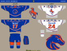
Boise State ice hockey, mainly to get myself back in the mood for concepts. This duo is a contemporary idea, amusingly enough not the first idea I had. I was originally gonna use New York Rangers-style diagonal lettering, but forgot to save the PNG. The prancing bronco on the white jersey is an updated version of Boise State's old logo that I'd wanted to use since I first saw it a few months ago.
boisestatehockey22main.png

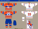
This set is intended as more of a throwback set, hence the orange sweater's similarity to the Montreal Canadiens. Not exactly the most exciting look, but relatively basic can be good.
boisestatehockey22alt.png
 
So this season, the New Jersey Devils unveiled a black third jersey that's been widely mocked for various reasons, mostly due to its being a jersey that reads Jersey (even though in common parlance, the "New" in New Jersey is frequently omitted; by contrast, I've never heard anyone call New York simply York), but also due to its resemblance to a Chicago Blackhawks throwback uniform. Much like the rival Rangers' famed Liberty jerseys were inspired by their goalie's iconic Statue of Liberty mask, the flames on Martin Brodeur's mask were the cue I took for this concept.
njdevilsalt22.png


Many a minor league baseball team will wear American flag themed uniforms for 4th of July home games. This is a more subtle take on the idea, something that would fit better in the majors, so red pinstripes and blue cuffs with stars was the general idea. Figured I'd do a patriotic logo while I was at it, and had two ideas.
cubspatriotic221.png
cubspatriotic222.png
 
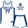
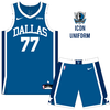
Dallas are in a desperate need of a new uniform set (and logo, which I haven't done). Their current uniform was okay for the time it was designed I guess, but I wanted to design a simple uniform set that has longevity and won't grow stale over the years.
DALLAS1.png
DALLAS2.png
DALLAS3.png
DALLAS4.png
 

Remove this Banner Ad

Back
Top