Workshop Template Feedback Thread

Remove this Banner Ad

Log in to remove this ad.

Just looking for some thoughts.
This is it with a design (I know the sash isn't on point lol):
View attachment 1228472
This is it without designs:
View attachment 1228474

Amy feedback would be appreciated :)

It looks excellent with no design, so I think you just need to adjust how the design sits on it a bit.

I assume you're using a smart object for the design and warping it? Looks to me like the sash and jeep logo needs to come up the shoulder a tiny bit, but guernseys are stretchy and can end up a bit off centre etc.

Where do the AFL and sponsor logos sit on the original image compared with your logos?
Thanks.

The design is made of a path that has a few curves and other edges in it, then it gets filled, blended to exclude so the creases, highlights and shadows show up, and rasterised so I can delete unwanted edges. Then I'll warp it to make it seem like it's sitting on the jersey. Not sure if that's a smart or not haha.

I'll can try to work the sash up but it doesn't really matter as it's not my NAFL design, it was just something to show people what it would look like with a design. I do have a bit of trouble with making the designs look realistically warped. If anyone has any tips on how to warp them to look realistic that would be great.

The AFL logo was slightly off because I lost the image so I had to find a similar image (I now have the image again yay). The sponsor logo is way off, same angle but different size, because the Hyundai logo is fairly different to the Jeep logo I wasn't sure how to place the Jeep logo, so now I'm going to just put it in the middle of the Hyundai logo. So they didn't set very well compared to the original image.

This is the original image for reference.
1610875971119_GJ734068J.2-2_auto_x2 (1).jpg

Edit: So I reworked it a little bit and this is how it came out:
Example.png
 
Last edited:
Thanks.

The design is made of a path that has a few curves and other edges in it, then it gets filled, blended to exclude so the creases, highlights and shadows show up, and rasterised so I can delete unwanted edges. Then I'll warp it to make it seem like it's sitting on the jersey. Not sure if that's a smart or not haha.

I'll can try to work the sash up but it doesn't really matter as it's not my NAFL design, it was just something to show people what it would look like with a design. I do have a bit of trouble with making the designs look realistically warped. If anyone has any tips on how to warp them to look realistic that would be great.

The AFL logo was slightly off because I lost the image so I had to find a similar image (I now have the image again yay). The sponsor logo is way off, same angle but different size, because the Hyundai logo is fairly different to the Jeep logo I wasn't sure how to place the Jeep logo, so now I'm going to just put it in the middle of the Hyundai logo. So they didn't set very well compared to the original image.

This is the original image for reference.
View attachment 1228495

Edit: So I reworked it a little bit and this is how it came out:
View attachment 1228511
looks good. my advice would be test another team with a lighter main colour. will help you know if you need to adjust the blending for the shadows/highlights or not.
 
looks good. my advice would be test another team with a lighter main colour. will help you know if you need to adjust the blending for the shadows/highlights or not.
You can see on the yellow the shadows are almost "flipped" if that makes sense, meaning the darker part on the right does not really make sense with the left part i.e. dark on top, light on bottom etc when on a light background.

1631678310970.png
Be hard to get 100% accurate, but it looks great so far!
 
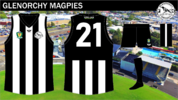
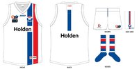
View attachment 1411258New to the footy graphic design game and looking for some feedback. This is the first template I've ever made, took some inspiration from a previous post.
I'm guessing it's based off this one I made? if you asked I would have sent it to you haha

BigFooty.com1293938683.jpg

but as for feedback, I'd say make the inside of the collar white or grey because footy guernseys are white when they're inside out. I'd also turn the background opacity waaaaaay down or I'd get rid of it completely
 
View attachment 1411258New to the footy graphic design game and looking for some feedback. This is the first template I've ever made, took some inspiration from a previous post.
I would say that the stitching gets a bit lost, notably on the back of the guernsey. Might need to rethink how it is displayed/applied. But other than that a solid kit for the purpose.
 

Remove this Banner Ad

Workshop Template Feedback Thread

Remove this Banner Ad

Back
Top