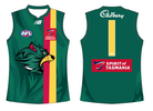
Discussion Tasmania AFL Jumper Design

Remove this Banner Ad

What is wrong with a plain jumper or unique patterns? Why are footy fans all obsessed about having to have something in the middle even if it's a crap object that prolly ruined Gold Coast or GWS jumpers?
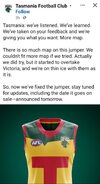
Nothing is wrong with it, it’s just a matter of execution. There’s a reason Gold Coast’s jumper gets shitcanned on here and Carlton’s doesn’t, and it’s not purely because it’s historical. It’s just that GC kinda didn’t do it the right way, it’s too bright and corporate feeling imo. For me I think Tasmania didn’t quite go for the right shade of each colour and it’s probably not their place to be wearing a representative jumper being a club of players from everywhere, therefore they missed out on an opportunity to try something just a little bit more radical and different.
 
As a born and bred Victorian, people are always surprised when I tell them I support West Coast and naturally ask why. My reasoning was because when I was in primary school, their mascot, logo, and colours really resonated with me (whilst them also being successful at the time in the 92-94 era). I'd always draw the mascot and logo all across my books etc.

I don't know which child now would be attracted to the horrific GC logo and bland guernsey, and to an extent GWS'.

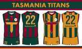
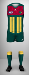
I think these 2 iterations really hit the nail on the head and would be a perfect launching pad for the team:

1711578572195.png 1711578586184.png
 

Log in to remove this ad.

As a born and bred Victorian, people are always surprised when I tell them I support West Coast and naturally ask why. My reasoning was because when I was in primary school, their mascot, logo, and colours really resonated with me (whilst them also being successful at the time in the 92-94 era). I'd always draw the mascot and logo all across my books etc.

I don't know which child now would be attracted to the horrific GC logo and bland guernsey, and to an extent GWS'.

I think these 2 iterations really hit the nail on the head and would be a perfect launching pad for the team:

View attachment 1941568View attachment 1941569

I also know a few born and bred Victorians that go for west coast because of the good colour combination and they liked it when they were kids. It just shows how important picking good colours and branding is, something the afl doesn't seem aware of.
 
Here's some concepts I made up for my Gather Round portfolio not too long ago. Based of one of the older state representative jumpers.
I think it's a nice mesh between a traditional and modern footy look. Works with both the 'Devils' and 'Islanders' moniker as well.
View attachment 1677018View attachment 1677019
View attachment 1677020

Just quickly did it up in Paint, that actually looks killer
View attachment 1677057


Similar design to your first one but closer to the colour pallet of what the state team is currently using, which I personally prefer:
View attachment 1682601

1867e4fde726f9ee40abdc59a3b68a0a88cb5616-16x9-x0y329w1854h1043.jpg
Just thought I'd go back through and pick out a couple of my favourite ones. Could definitely play around with ToxicTiger11 as a clash. This was on the first 8 pages btw! So many good ones. Can't believe the talent on this board
 
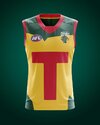
I don’t know if I ever put this one in here, I made it for a portfolio but I think if something like this was their home jumper it could’ve been one of the best in the AFL. I’m sure there’s a better way to do the embossed effect but that was the best I could muster up. But of course they went for more washed out versions of all the colours which doesn’t make it easy at all.
IMG_2690.png
 
Is it bad I actually kind of like that? It would work well as an clash jumper version of the state jumper (gives me Essendon fat sash vibes).

I'd love to see it flipped with green as the map and yellow/red on the outside. The T is a bit extreme too but it's a bit GWS which I don't mind (and it has some historical relevance).
 

(Log in to remove this ad.)

Here's a very quick mockup from a thought I had. The T in the negative space, the dual lines on either side - somewhat to represent the two cities, but wanted lines on both sides. Not sure if I like the pattern being in the green, but ideally would be very subtle.
Not very refined but just thought I would quickly put the thought on paper.


tas.PNG

Thanks Dylan8 for the template.
 
Here's a very quick mockup from a thought I had. The T in the negative space, the dual lines on either side - somewhat to represent the two cities, but wanted lines on both sides. Not sure if I like the pattern being in the green, but ideally would be very subtle.
Not very refined but just thought I would quickly put the thought on paper.


View attachment 1972989

Thanks Dylan8 for the template.

Just InCase popping their head in for the first time in 9 years!!
 
I had the basic idea for this design about ten years ago and had a rough drawing. Now Tassie is happening and I know my way around Illustrator I've been inspired to finally making a good polished version with updated colours etc. View attachment 1975525

Amazing idea, this looks pretty cool. 10x more effective than the AI looking garbage they’ve gone with
 

Remove this Banner Ad

Discussion Tasmania AFL Jumper Design

Remove this Banner Ad

Back
Top