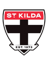
News New Saints' Logo

Remove this Banner Ad

Saints should keep their motto visible. Ditto Blues. The real shame is the Dogs not using "Cede Nullius" more - it's a pretty badass phrase

I like that Adelaide took up a Latin motto even though they were founded long after that went out of fashion.
Off topic, but I heard that Collingwood's "Floreat pica" refers to a wrong type of bird. Does anyone know if that's right?
 
Off topic, but I heard that Collingwood's "Floreat pica" refers to a wrong type of bird. Does anyone know if that's right?
I'd say it refers to the European magpie rather than the Australian magpie, so should be "Floreat tibicen" perhaps
 
Last edited:
Thought I should get this started considering...


If there was one club who didn’t need to change its badge, that would be St Kilda.

Ngapa GIF
 

Log in to remove this ad.

So is the consensus that it'll probably be a variation of the current shield? Or something new alltogether?
 
Shield teaser from the club.

I now wonder if it's gonna be the logo seen in the Saints' rooms post game.

The one with what looks like a condensed Eurostile like font.

View attachment 2168554
Looks to have a slightly curved top which could be very nice. I like the fonts used for the date and in the background way more than the Eurostile one. Curious if this means there won't be a ribbon anymore. It's highly unlikely, and could just be missing for the sake of simplicity in this teaser, but if it's the case they removed it and this was the first sign that would be very interesting.
 

(Log in to remove this ad.)

Change for the sake of change but I don't hate it. Easily the best of the three released this offseason. I particularly like the red and black on the sides of the ribbon
 

Remove this Banner Ad

News New Saints' Logo

Remove this Banner Ad

Back
Top