TheBillABCTV
Senior List
- Oct 4, 2021
- 205
- 54
- AFL Club
- Port Adelaide
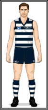
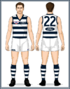
Mero on your website if you go to season by season then select 1995 then select Geelong The uniforms from Round 1 to the Prelimanary final only shows the front. The Grand Final the uniform has front and back. I have the uniform from Round 1 and round 2, then for the Grand Final. The Grand final is is correct front and back.