Discussion Sir Doug Nicholls Round 2024 (Rds 10 & 11): Photos and Discussion

Remove this Banner Ad

Hi everyone, welcome to the Sir Doug Nicholls Round thread. After the discussion and guernsey drops took place in the New Jumpers thread as it fairly standard, I have moved everything across to its own individual thread ahead of the next fortnight's games being played.

The following links are from the AFL website; it allows you to check out all the club names, guernseys, Sherrin design, and listen along to some tunes while you do so. Enjoy.


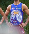
its a bit BCF fishing shirt. but i do like the yellow base, partic if worn with blue shorts
who are the eagles playing when they wear it?
I was literally about to say that, the long sleeve especially looks like a fishing shirt
 
The more of them we see, the more I start to dislike the designs that treat the jumper as just a canvas. It rarely converts into a striking on-field appearance. Much prefer those that maintain the basic design.
Exactly. I would expect any Collingwood jumper to have black and white stripes as part of the design. Similarly West Coast jumpers should have the wings as part of their design - that should be the starting point.

Freo designs using boomerangs as chevrons are an excellent way of keeping it a freo jumper, while incorporating the first nations symbols / artwork.

No matter how good it looks, it's not an Eagle's jumper - it's just a jumper with an eagle on.
 

Log in to remove this ad.

No matter how good it looks, it's not an Eagle's jumper - it's just a jumper with an eagle on.
Club colours ✅
Eagle head ✅
Represents where we’re from ✅
Designed by a local artist ✅

That sounds an awful lot like an Eagles jumper to me.

We’ve worn plenty of guernseys without wings in our 37 seasons in the comp.
 
I really like our Indigenous jumper this year. I may be one of few but I prefer allowing the artist to fully express their vision without being constrained by an existing design. I love the meaning behind every artwork and the less clubs get in the way of First Nations artists, the better.
 
Worst Eagles indigenous kit. When ai first saw it I thought it was a joke. It looks like those fake merch that those dodgy sites on Facebook advertises
The worst one was definitely the snake one from 2022, IMO.

One small change I’d make to it is blue cuffs/collar. Would help break all the gold up a bit.
 

(Log in to remove this ad.)

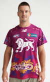
Preview of Lion’s guernsey, released tomorrow.
Lion is too small, would have been better if the maroon parts of the jumper were also made blue and they included more dot art throughout the design. The design looks slapped on and out of place with the rest of the jumper being left bare.
 
Last edited:
The worst one was definitely the snake one from 2022, IMO.

One small change I’d make to it is blue cuffs/collar. Would help break all the gold up a bit.
Nah that has this covered easily. This looks like generic merch. The eagle head on the WA logo just looked like it was mashed together last minute. The other jumpers look classy af
 
Won't lie, think the designs are getting worse but far out do they sell exceptionally well. it's all you see at games these days. funny how marketing works, all the birdheads that got around and lasted about four years.
 
Wish Brisbane had the balls to put the Lion on the chest, like their Fitzroy jumper a few years ago.
Dont disturb the artwork imo
 

Remove this Banner Ad

Back
Top