Navigation
Install the app
How to install the app on iOS
Follow along with the video below to see how to install our site as a web app on your home screen.
Note: This feature may not be available in some browsers.
More options
-
 BigFooty Tipping Notice Img
Weekly Prize - Join Any Time - Tip Round 10
The Golden Ticket - MCG and Marvel Medallion Club tickets and Corporate Box tickets at the Gabba, MCG and Marvel.
Round 9 Winner: philreich
-
You are using an out of date browser. It may not display this or other websites correctly.
You should upgrade or use an alternative browser.
You should upgrade or use an alternative browser.
Workshop Soccer Kit Designs (Mockups)
- Thread starter Fizzler
- Start date
- Tagged users None
- Jul 9, 2010
- 24,163
- 26,537
- AFL Club
- Fremantle
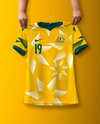
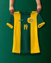
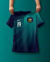
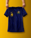
The home shirt here is tidy. That sponsor logo is a nuisance and so gross looking, but I guess that isn't your issue. Like the thick middle band just appearing at the top – sponsorship integration is a rare art and when it's done well, it looks nifty. Good idea.NEWCASTLE UNITED: I've always thought that newcastle is one of those clubs that looks best with the logos all running down the middle of the shirt (which they might be going back to next season, fingers crossed) The away is pretty similar to the current season's but it is a awesome colour combo so I've decided not to change it.

Nice wordmark for the logo too. I could see it being a real brand.
fancyscum
Radical Crommunist
DYLANROO18
Debutant
created a Bristol team in fifa (chose a big city with little success) but thought i could do a bit better in PS, let me know your thoughts pls and thank you!
The logo features Cabot tower found in Bristol and SS great britain which was built in Bristol and at the time of construction was the longest passenger ship in the world, the ship can still be viewed in Bristol.


The logo features Cabot tower found in Bristol and SS great britain which was built in Bristol and at the time of construction was the longest passenger ship in the world, the ship can still be viewed in Bristol.


fancyscum
Radical Crommunist
- Aug 4, 2013
- 1,004
- 2,066
- AFL Club
- West Coast
- Other Teams
- Perth Scorchers, Gladbach, Kyoto Sanga
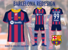
Cool template
kermittheslob
Draftee
- Mar 28, 2022
- 19
- 81
- AFL Club
- North Melbourne
these are all fire IMO
these are incredible
- Jul 25, 2021
- 179
- 199
- AFL Club
- Richmond
- Other Teams
- Persib Bandung (EST.1933),
Anyone got templates for this? Ideally like Fancyscum's
- Jul 25, 2021
- 179
- 199
- AFL Club
- Richmond
- Other Teams
- Persib Bandung (EST.1933),
Similar threads
- Replies
- 0
- Views
- 205
- Replies
- 42
- Views
- 2K


