Gold Coast SUNS guernsey discussion

Remove this Banner Ad

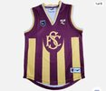
e3e1d544c59a0339c33f9cf5d1cc12e4.jpg


How did we ever let this slip through our fingers….


Sent from my iPhone using BigFooty.com
It’s crazy that we are paying a marketing team probably hundreds of thousands of dollars to just not #b#bringbackthewavehen it clearly seems the favoured option by actual Suns fans, at least in my experience.

I imagine an updated version would be a huge hit locally. Bizzare that they haven’t ever explored it.
 

Log in to remove this ad.

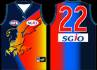
Well this will be an interesting thread to follow. I can't remember how much I've talked about the guernsey on here but I like the base design and colours even if I dislike the logo. I despise gradients but it seems like I'm in the minority on that. I guess we'll have our version of the WCE Ochre design?

The logo is really tricky when you've got a team called the Suns, because having a sun logo rarely works, and with name the lettering can look naff if done wrong.

Screw it, Praise the Suns!

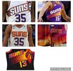
1715269430831.png 1715269701046.png
 
I think my problems with the SUNS name is that it is almost symmetrical but also not. Like a 'close but no cigar' thing that can look kinda awkward

Yeah I tend to agree, Feel like if they used a better font they could make it LOOK more symmetrical. Still firmly on the side of logo over text though


Sent from my iPhone using BigFooty.com
 

Remove this Banner Ad

Back
Top